
OnStar Design System
Overview
The OnStar Design System was created to establish a unified foundation of design tokens, UI components, and interaction patterns for OnStar’s growing ecosystem of digital products. Designed to support both web and mobile experiences, the system aimed to provide a scalable framework that product teams could use to create consistent and accessible interfaces.
Working closely with our agency partner and internal teams, we defined core foundations, built a component library, and documented reusable patterns intended to streamline future product development across the OnStar platform.
Role
Lead Product Designer
Project Duration
Jun - Aug 2025
Scope
Workshop Facilitation, Design Systems, Component Libraries, Advanced Components, Design Tokens
The problem
OnStar’s digital products were being designed and built without a shared system of UI patterns or components. As a result, inconsistent interfaces began appearing in production, leading to frequent one-off design work and custom development that slowed both design and engineering teams.
At the same time, recently updated brand guidelines from our agency partner focused primarily on web experiences and did not address the growing suite of OnStar mobile applications, leaving teams without clear guidance for cross-platform design.
Goals
Extend the OnStar brand
to mobile experiences
Expand the updated brand guidelines to support mobile experiences while maintaining alignment with the core OnStar visual identity.
Design an accessible
and inclusive system
Create an accessible and intuitive system that supports a broad range of users, including a large portion of OnStar Guardian customers over the age of 50, ensuring readability, clarity, and ease of interaction.
Establish consistent
UI patterns
Define reusable components and interaction patterns to eliminate one-off designs and reduce inconsistencies across products.
Improve design–engineering collaboration
Provide developers with a clear and consistent set of components, tokens, and documentation to streamline handoff and accelerate development.
System foundations
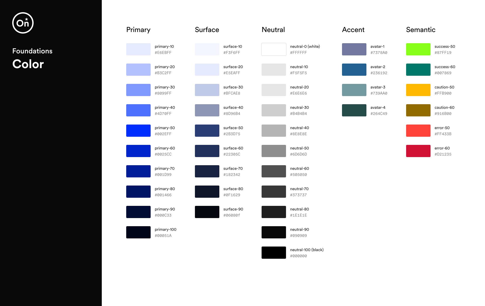
Color
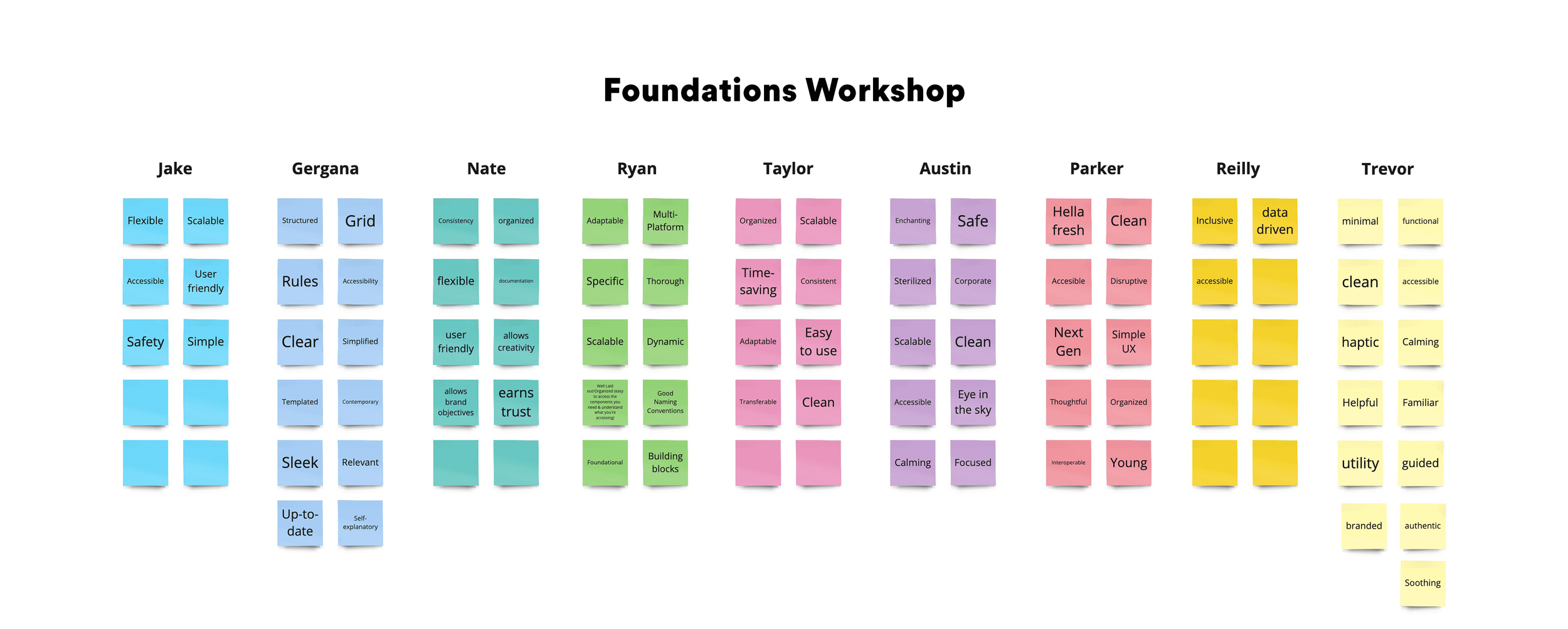
I facilitated a series of workshops with the team to explore how color could reinforce the OnStar brand. Using the primary OnStar blue as a foundation, we developed a cool neutral palette that conveys confidence, authority, and trust while maintaining a calm and familiar interface.
The primary blue is used intentionally for emphasis—helping establish a clear hierarchy and guiding users toward important actions.
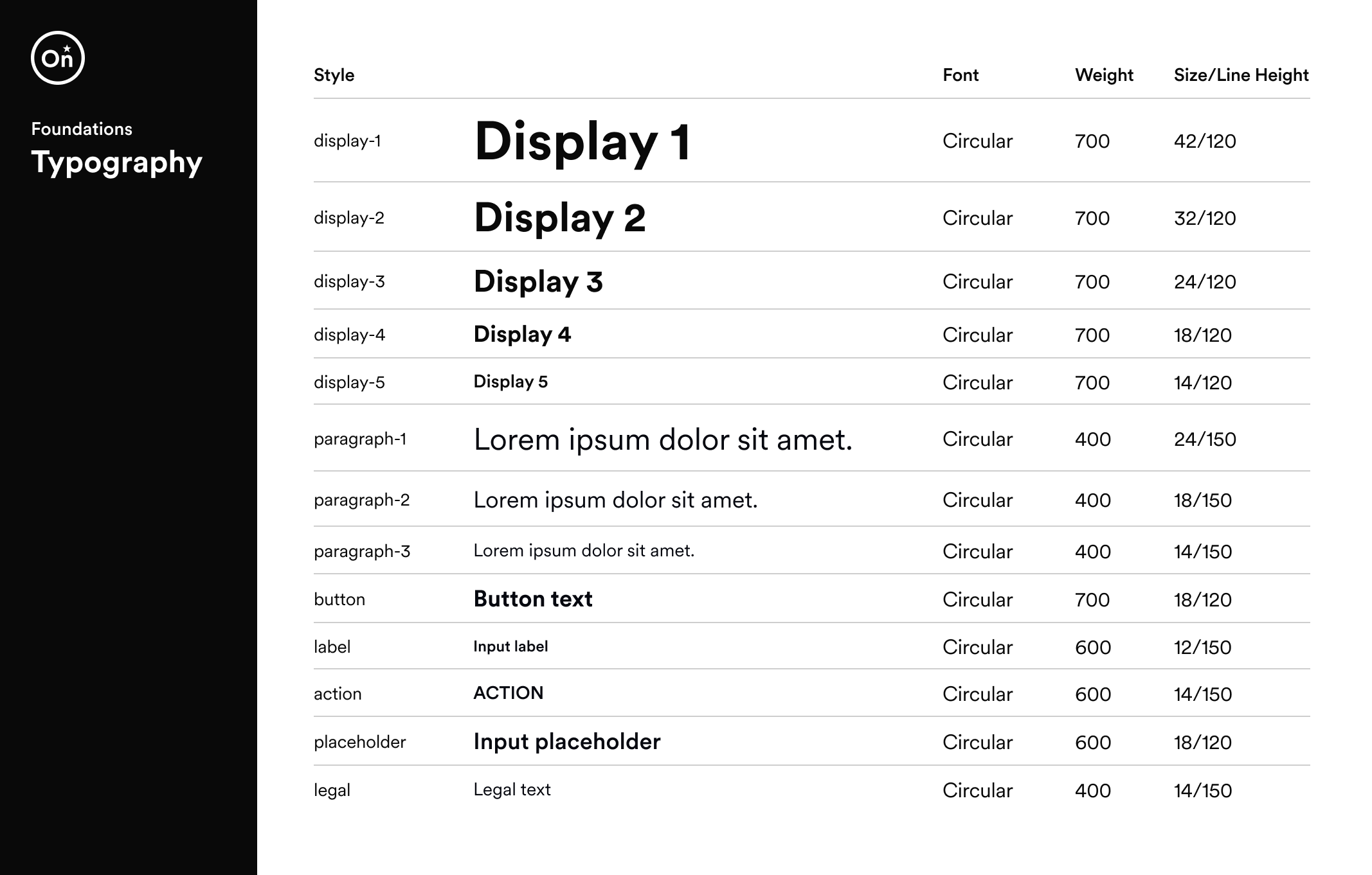
Typography
Through a series of typography workshops, we evaluated multiple type scales and selected a medium-to-high contrast system that provided strong visual hierarchy across both desktop and mobile interfaces.
To improve readability and accessibility, we increased the base font size to 18px, creating a more comfortable reading experience for a broad range of users.
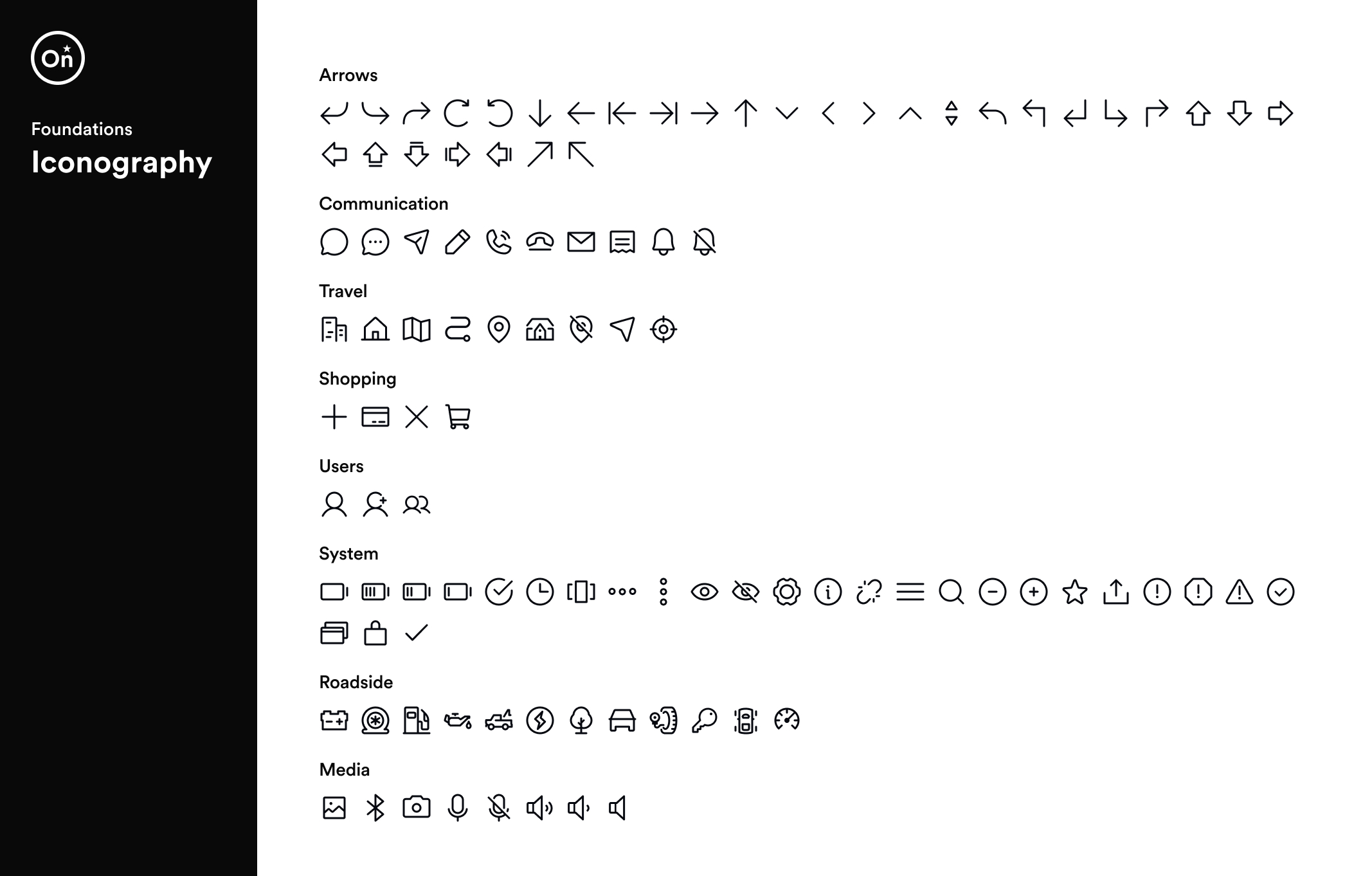
Iconography
The icon system uses rounded line icons to create a friendly and approachable visual language aligned with the OnStar brand. A consistent stroke weight and simplified forms ensure icons remain clear, recognizable, and scalable across both mobile and desktop interfaces.
Components
Building on the system foundations, we developed a library of reusable UI components to support consistent and accessible experiences across OnStar products. Each component was designed with clear interaction patterns and scalable structure to help teams design and build interfaces more efficiently.
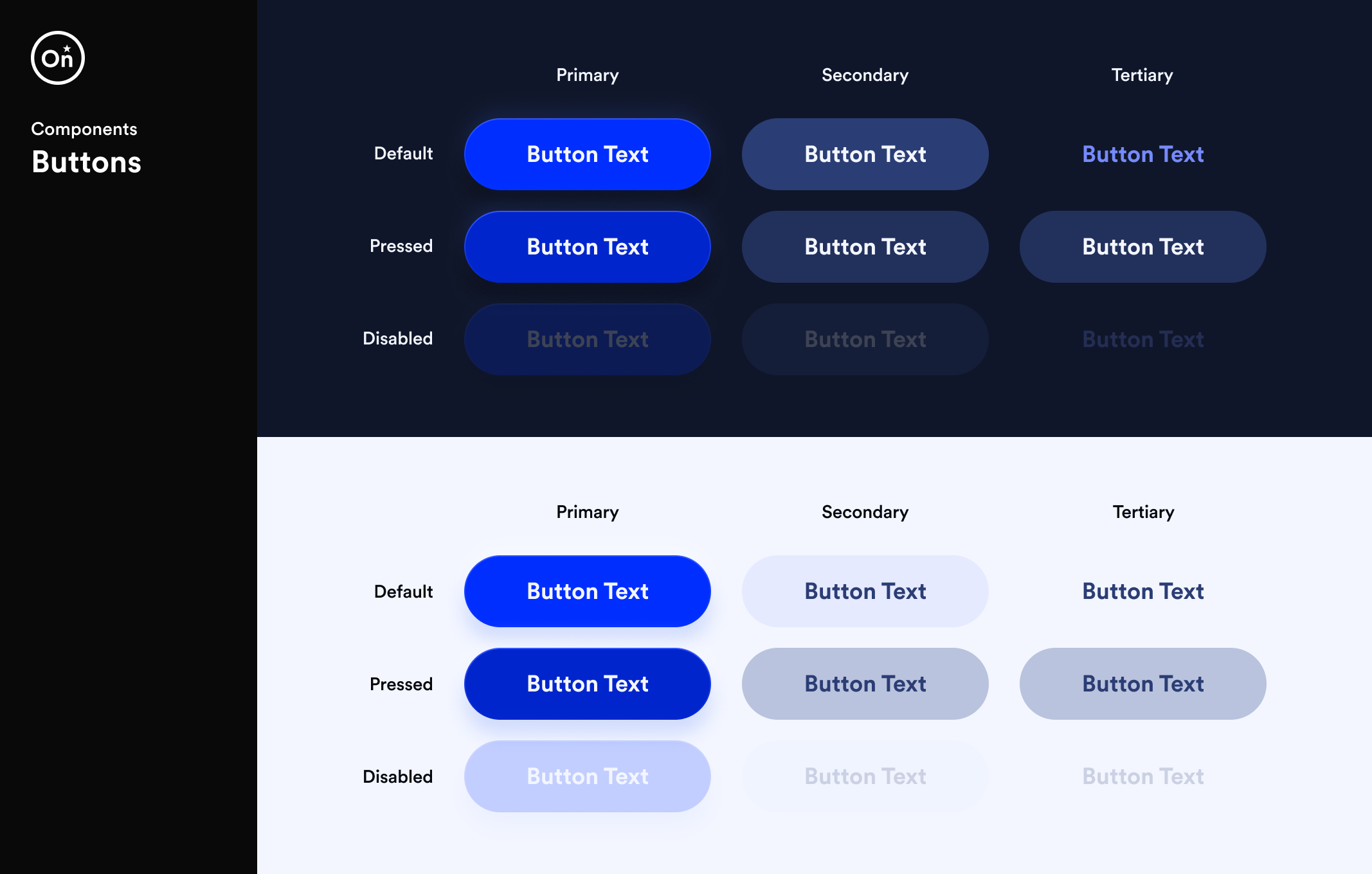
Buttons
Buttons were designed with accessibility and usability in mind. The component uses 18px bold text to ensure strong readability and clear action hierarchy. A 56px button height, exceeding WCAG’s recommended minimum touch target size, provides a comfortable and forgiving tap area—improving interaction across both mobile and desktop experiences.
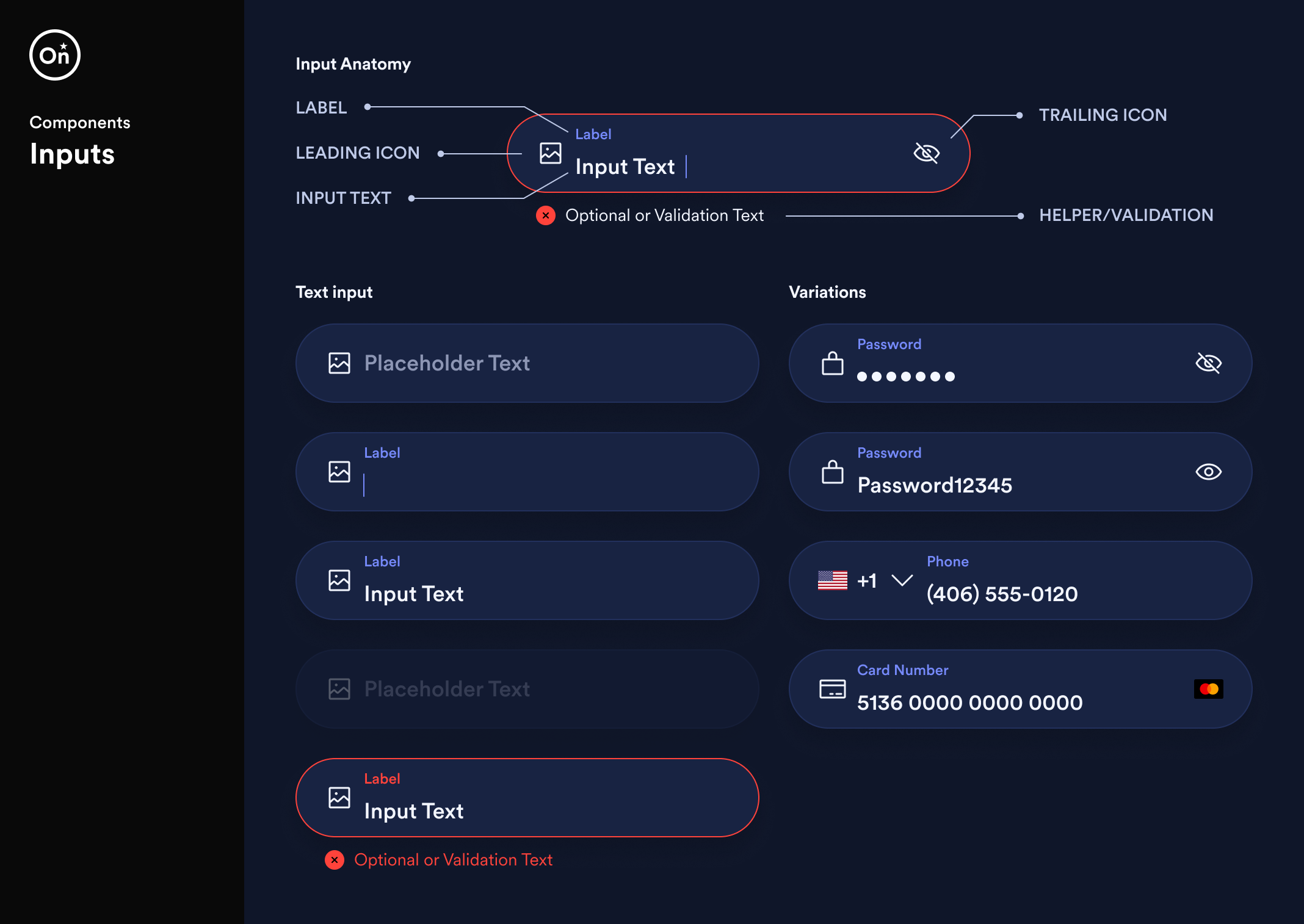
Input fields
Input fields were designed to prioritize readability and ease of interaction across devices. Both placeholder and input text use the 18px base font size, ensuring content remains clear and legible. The field height was set to 56px, exceeding WCAG’s recommended minimum touch target size to provide a comfortable and accessible input area for users.
The component supports multiple input types—including text, password, phone, and credit card—while maintaining consistent structure and interaction patterns.
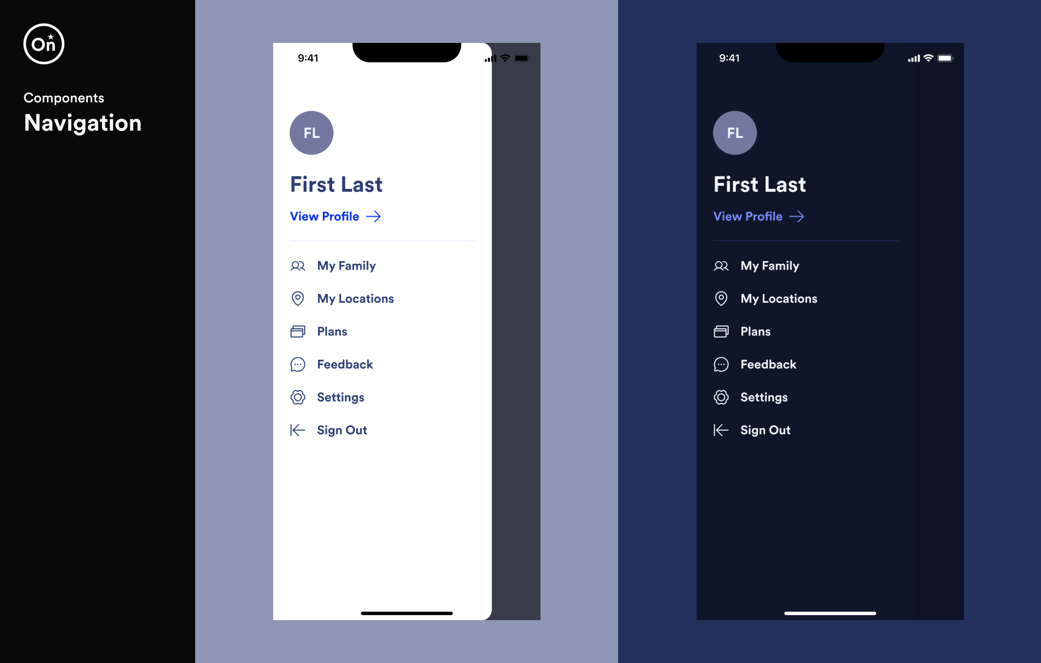
Navigation
The navigation pattern prioritizes clarity and quick access to key areas of the application. Icons and labels work together to create a clear hierarchy while maintaining consistent spacing and alignment across both light and dark themes.
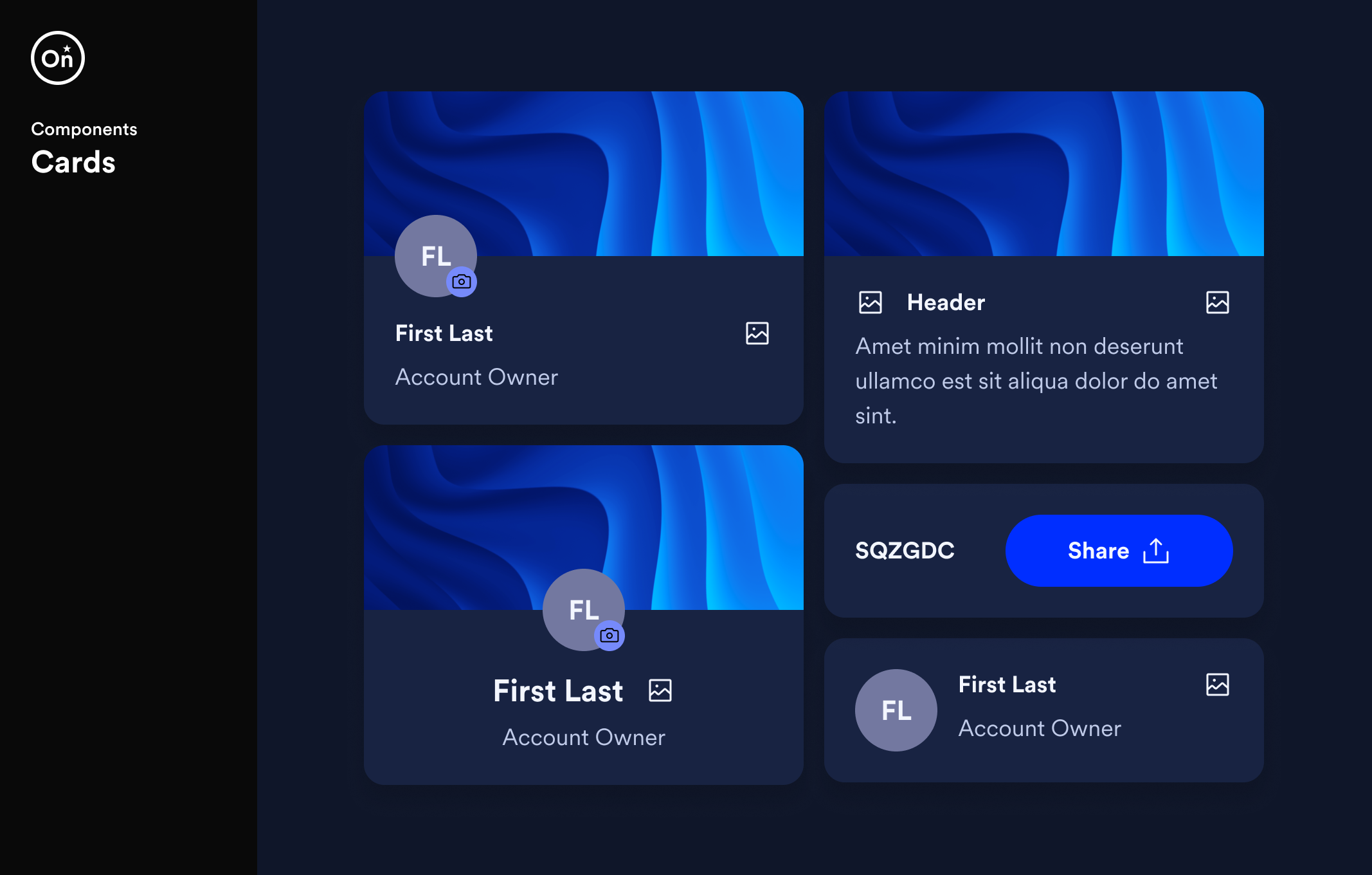
Cards
Because cards were used throughout OnStar’s mobile applications to present different types of content, we designed a flexible card component that could support a wide range of use cases while maintaining visual consistency.
Using component properties in Figma, designers could dynamically adjust the structure of the component—allowing the card to scale across multiple scenarios without creating additional variations.
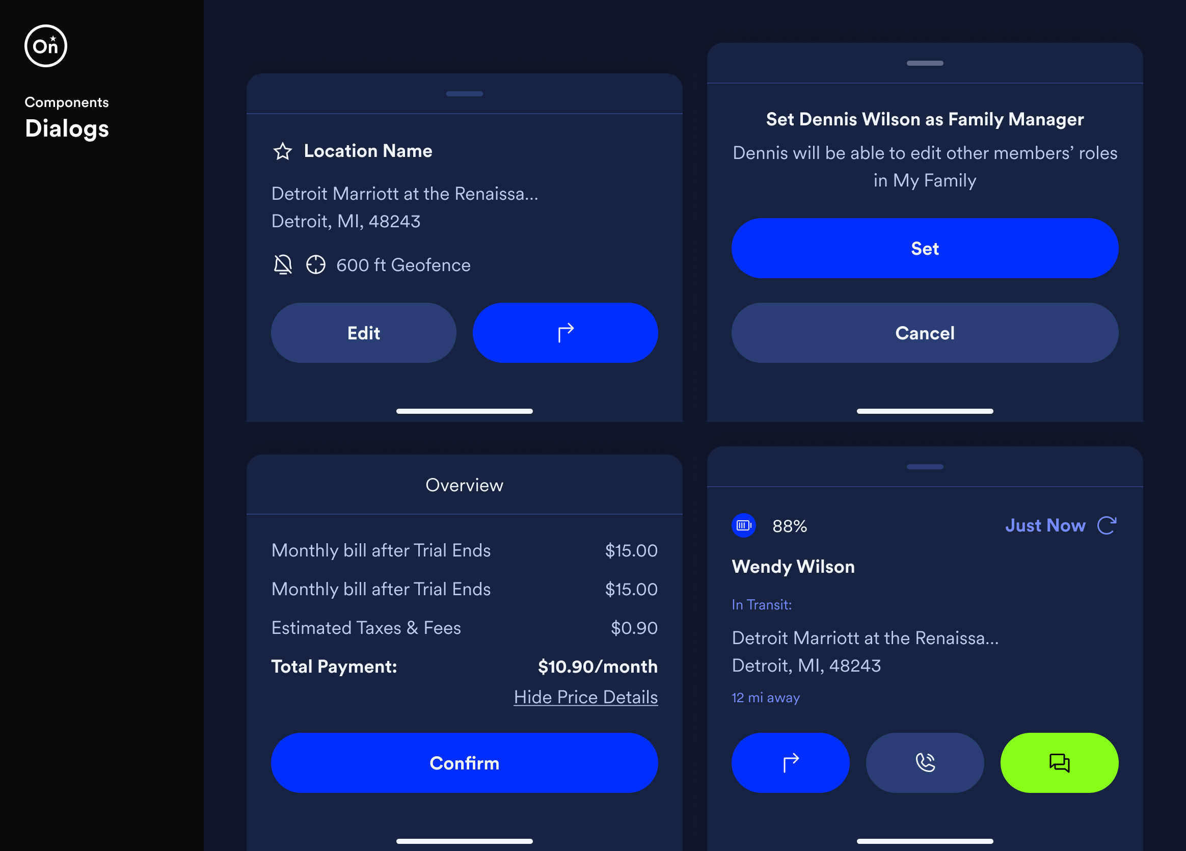
Bottom sheet dialogs
Dialogs help bring focus to important moments in the interface, presenting key information and prompting users to take action without disrupting their workflow. The component supports a variety of scenarios while maintaining a consistent structure and hierarchy.
Using configurable properties in Figma, designers could adjust titles, content, and actions to support different interaction patterns within a single component.
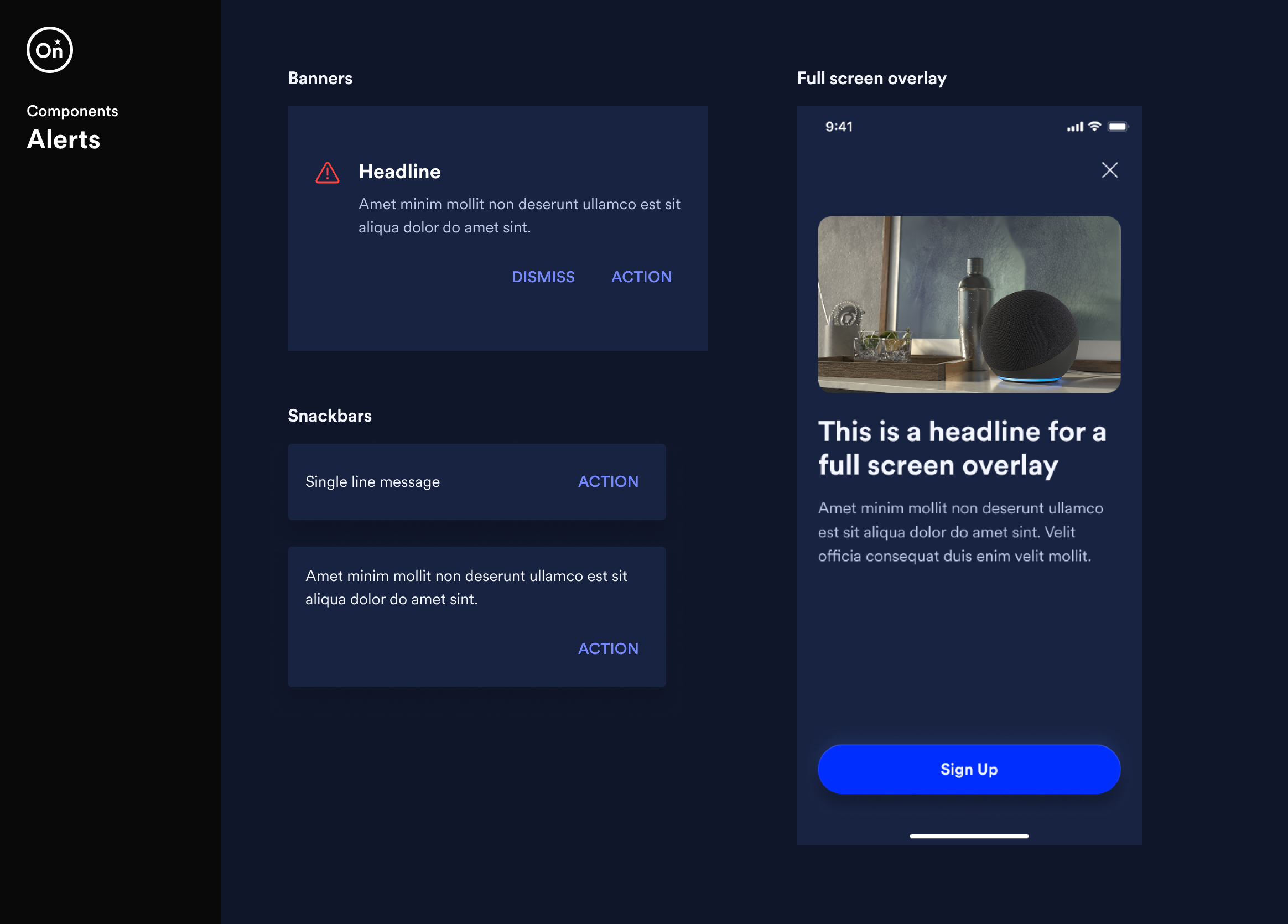
Alerts
Alert components communicate important information and system feedback to users at varying levels of urgency. The system includes banners, snackbars, and full-screen overlays, allowing messages to be delivered in ways that range from subtle notifications to more prominent interruptions when user attention is required.
Each pattern maintains consistent visual hierarchy and interaction behavior to ensure messages are clear, actionable, and easy to dismiss.
Design tokens
To ensure consistency and scalability across the design system, we established a set of design tokens that defined the foundational visual properties of the interface. Tokens provided a centralized way to manage values such as color, typography, spacing, and elevation.
By abstracting these values into reusable tokens, designers and developers could apply consistent styling across components while maintaining flexibility for future updates. This approach helped create a shared language between design and engineering, making it easier to maintain visual consistency across OnStar’s digital products.
Collaboration